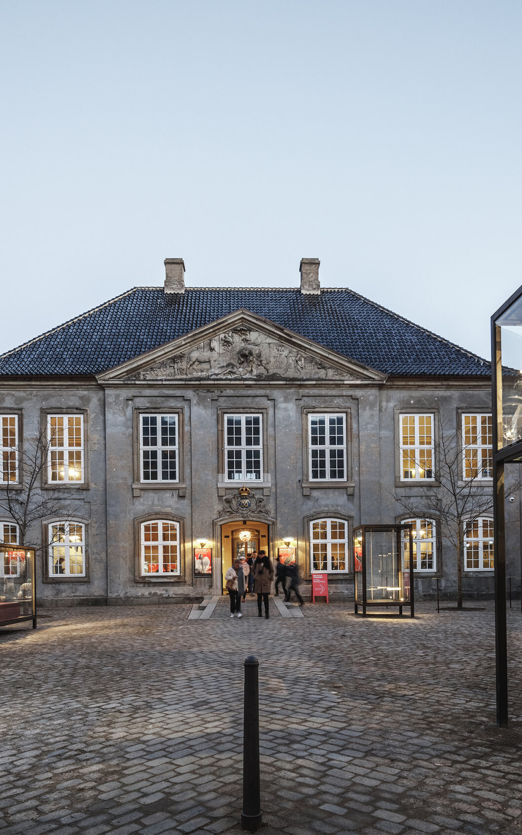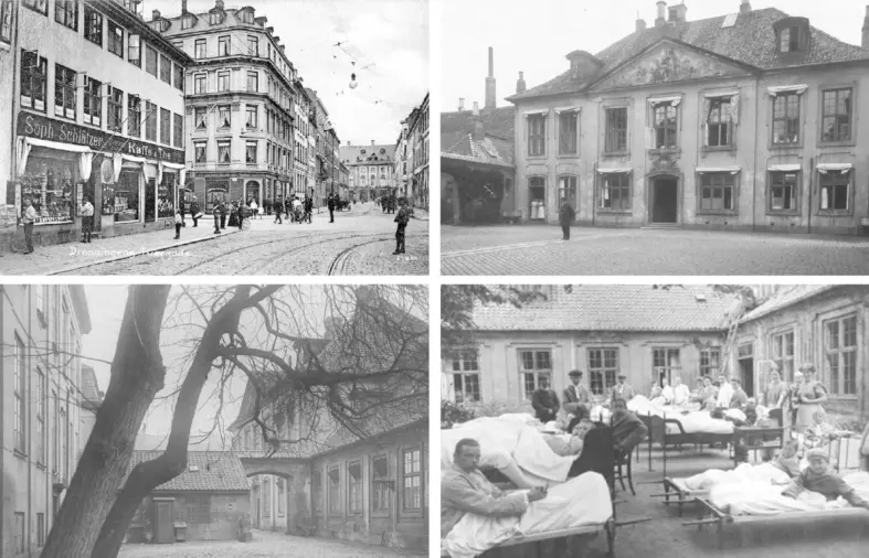
Constructed in the 1750s, the buildings used to house the Royal Frederick's Hospital, which was the first public hospital in Denmark. In the 1920s, the buildings were renovated and adapted to museum use by Danish architects Ivar Bentzen and Kaare Klint.
exhibition
Designmuseum Danmark is located in Copenhagen’s historic centre in the neighborhood of Frederiksstaden, which is considered one of the most important rococo complexes in Europe. In the early 1920s, the building was renovated and refurbished for museum.
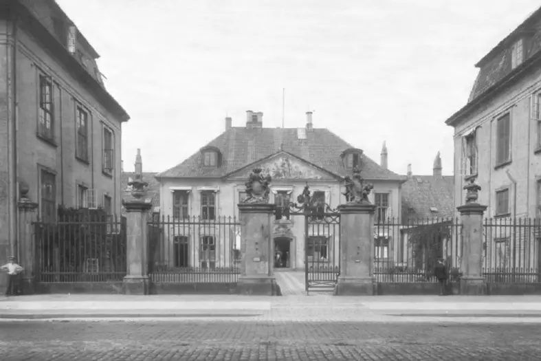
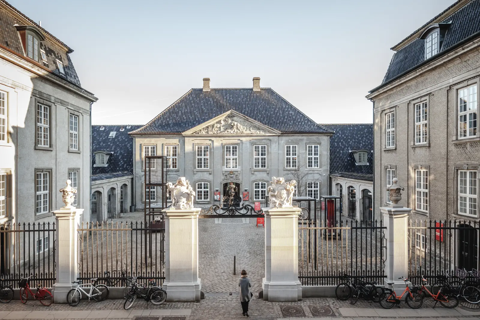
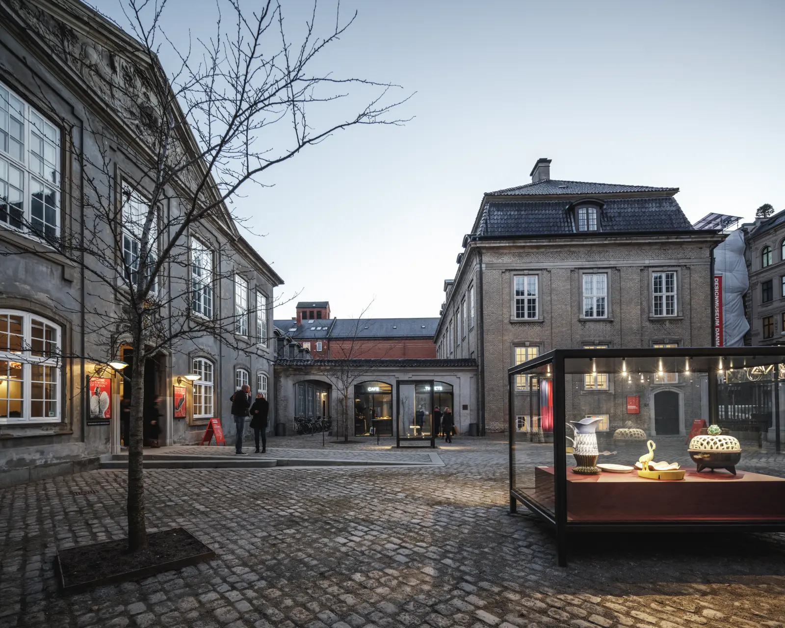
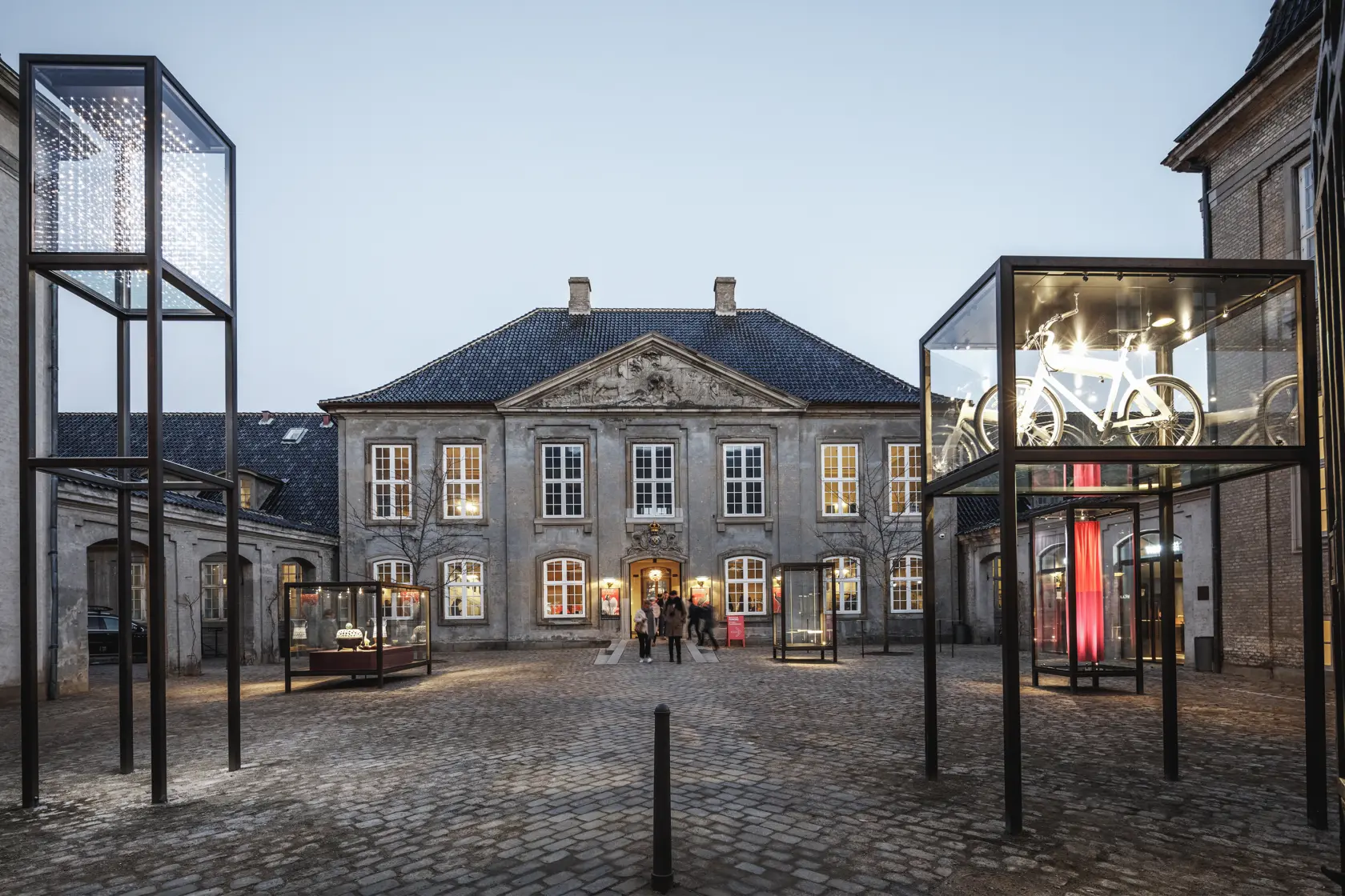
The new plaza in front of the museum’s 18th-century building creates a meeting place and a showcase for Danish design. The project improves the accessibility of the museum while the sculpture gate and protected pavement is renovated. The exhibition platform creates an openness between the museum and its surroundings, thus giving the public a taste of the museum’s treasury.
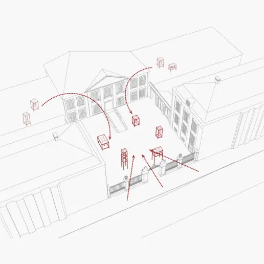
The project brings the museum outside on the plaza.
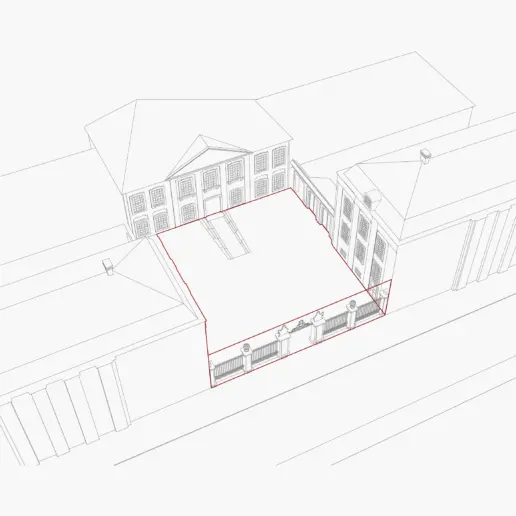
The plaza is repaved to unify the space with enhanced architectural and urban value and the scupltural gate restored.
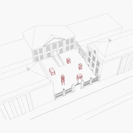
A selection of new outdoor display cases, inspired by the museum’s Kaare Klint display cases, brings the exhibition outside.
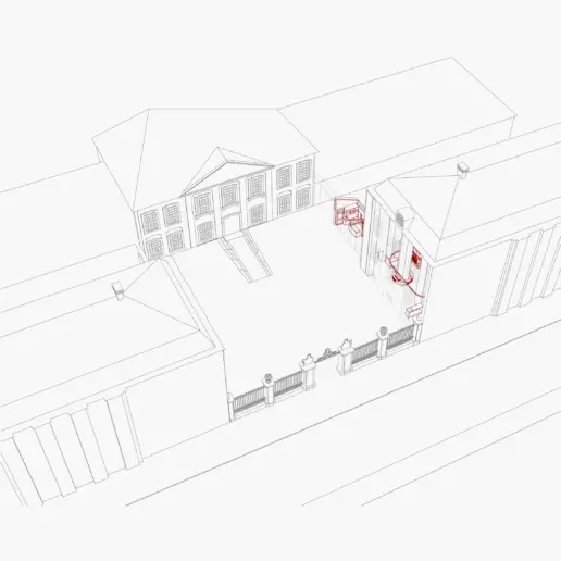
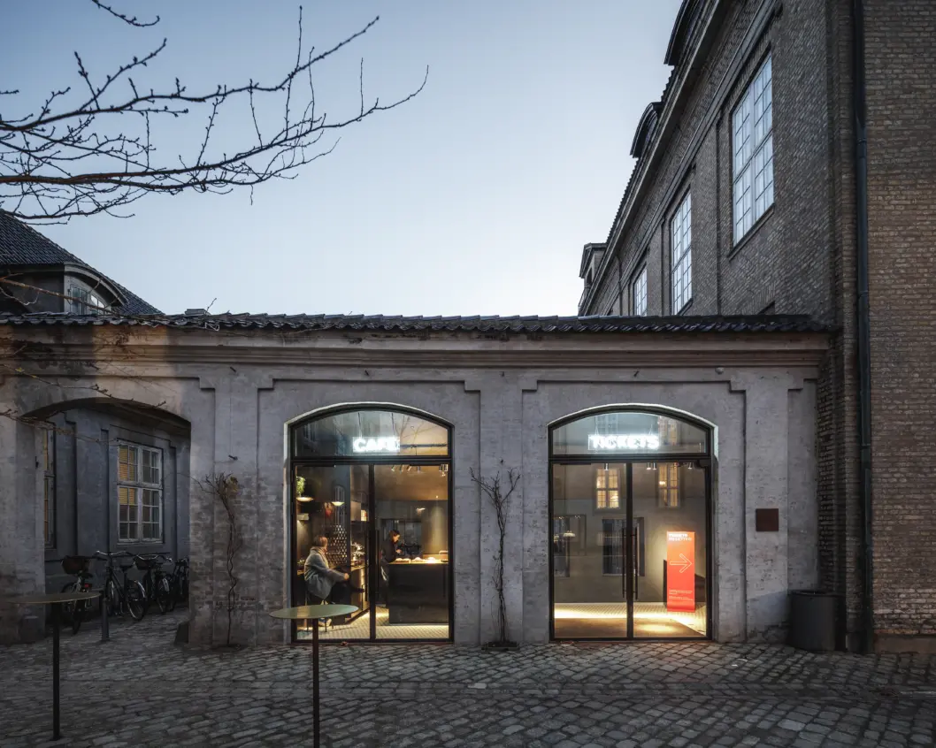
A new entrance is created through the adjacent annex, housing café, ticket office and museum shop.
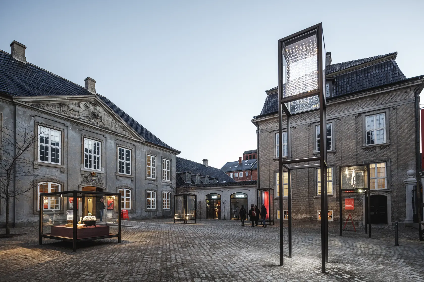
In the 1920s, the former hospital was converted into a museum by architect Kåre Klint, who also designed all the furnishings for the museum – including a series of unique display cases, which remain in use to this day. Now, 100 years later, we have added an outdoor interpretation of Klint’s display cases to enable the museum to move exhibits and activities outdoors. We have turned the museum inside out in order to invite the city in, creating an outdoor meeting place and an accessible exhibition experience with free admission round the clock.
Dan Stubbergaard, architect and founder, Cobe
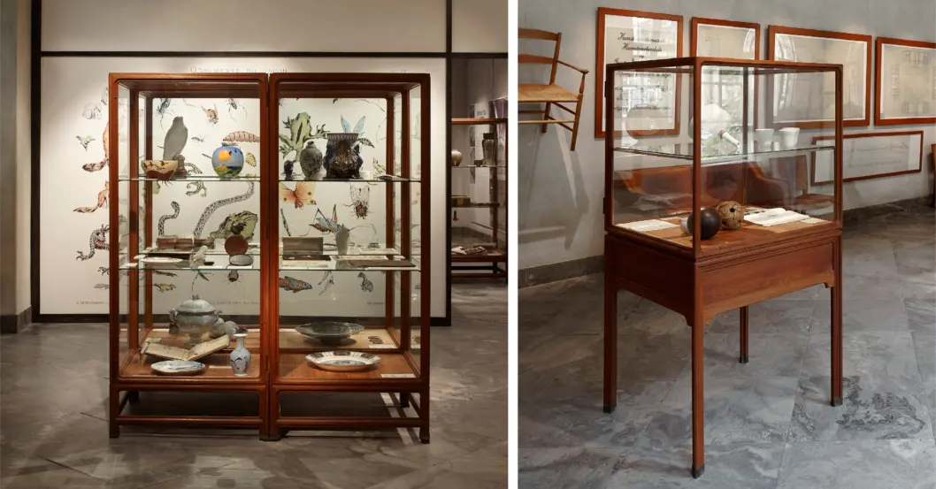
The special designed exhibition showcases by Danish architect Kaare Klint. Photos by Pernille Klemp, Designmuseum Danmark.
Danish architect Kaare Klint redesigned the building into the museum we know today, including its entire inventory and a selection of iconic display cases exhibiting the museum’s exemplary design collection. Inspired by these display cases, a new selection of outdoor display cases brings the museum outside.
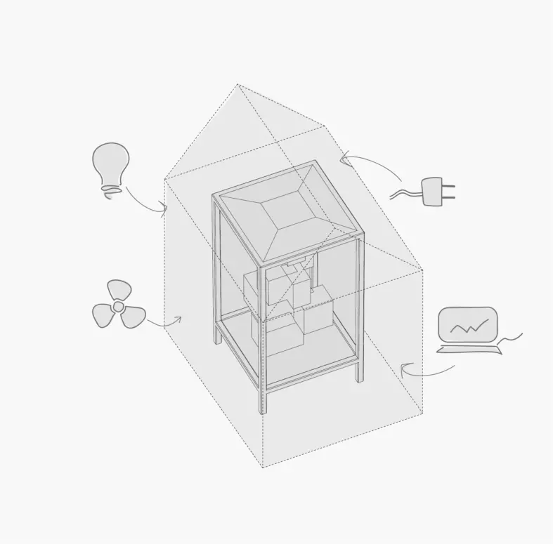
To protect the museum artifacts the display cases act as independent houses with integrated electricity, data, ventilation and lighting control.
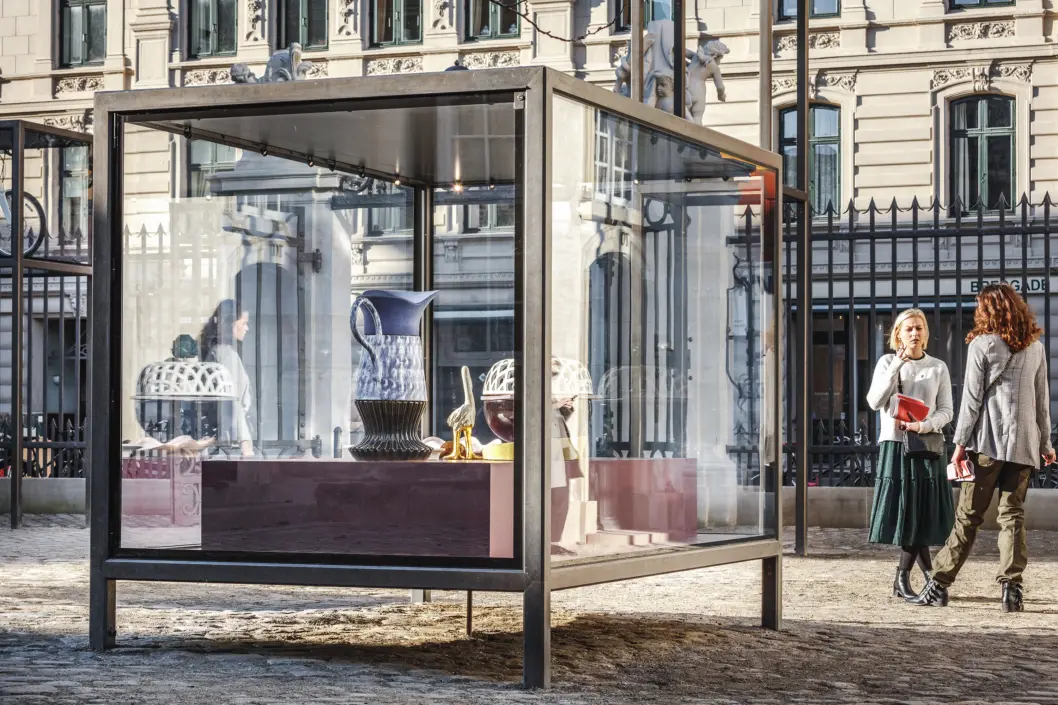
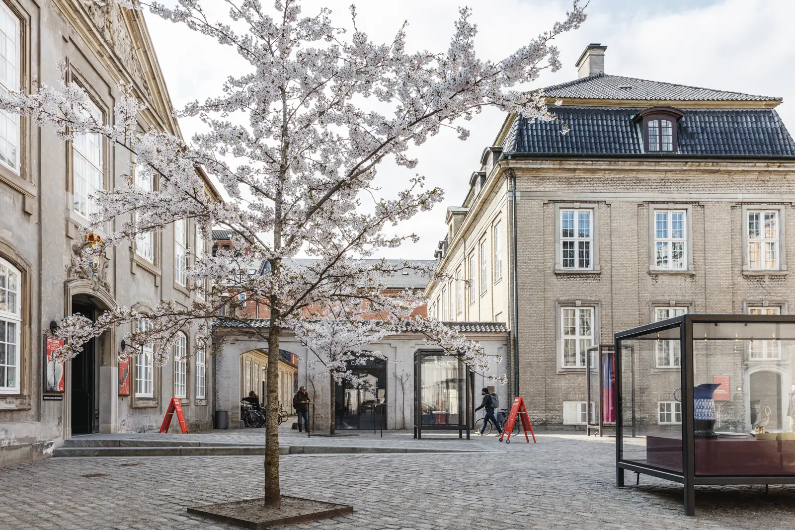
The historic rococo building is beautifully merged with the new architectural layers. The museum’s new plaza ties the space together and creates an exhibition platform and context that opens the museum.
The existing granite and sandstone paving are reused. The brass used for the display cases and door profiles as well as steel used for the interior café and bookshop can be recycled to new purposes in the future.
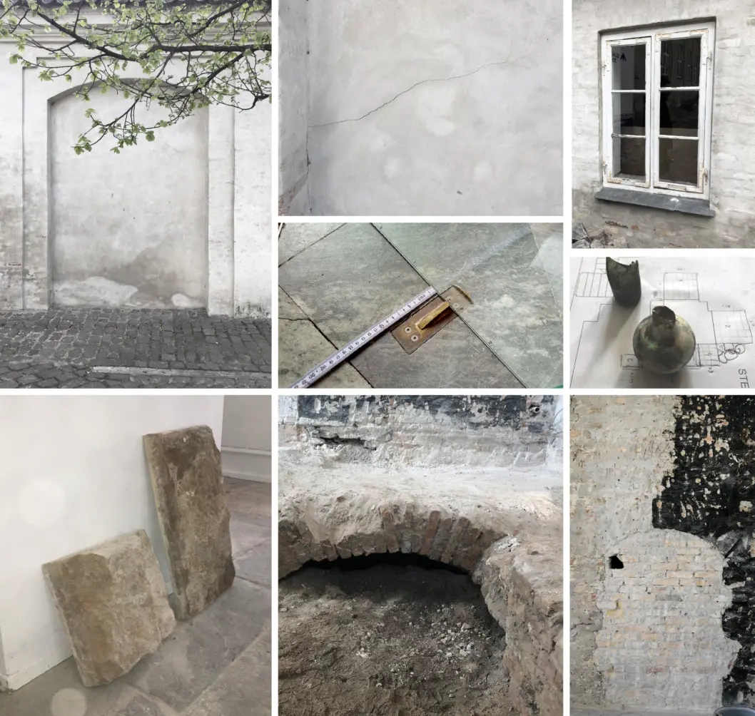
Working with the transformation of a protected building requires historical understanding and respect. Everything was carefully registered, such as the existing floor which was numbered and replaced afterwards.
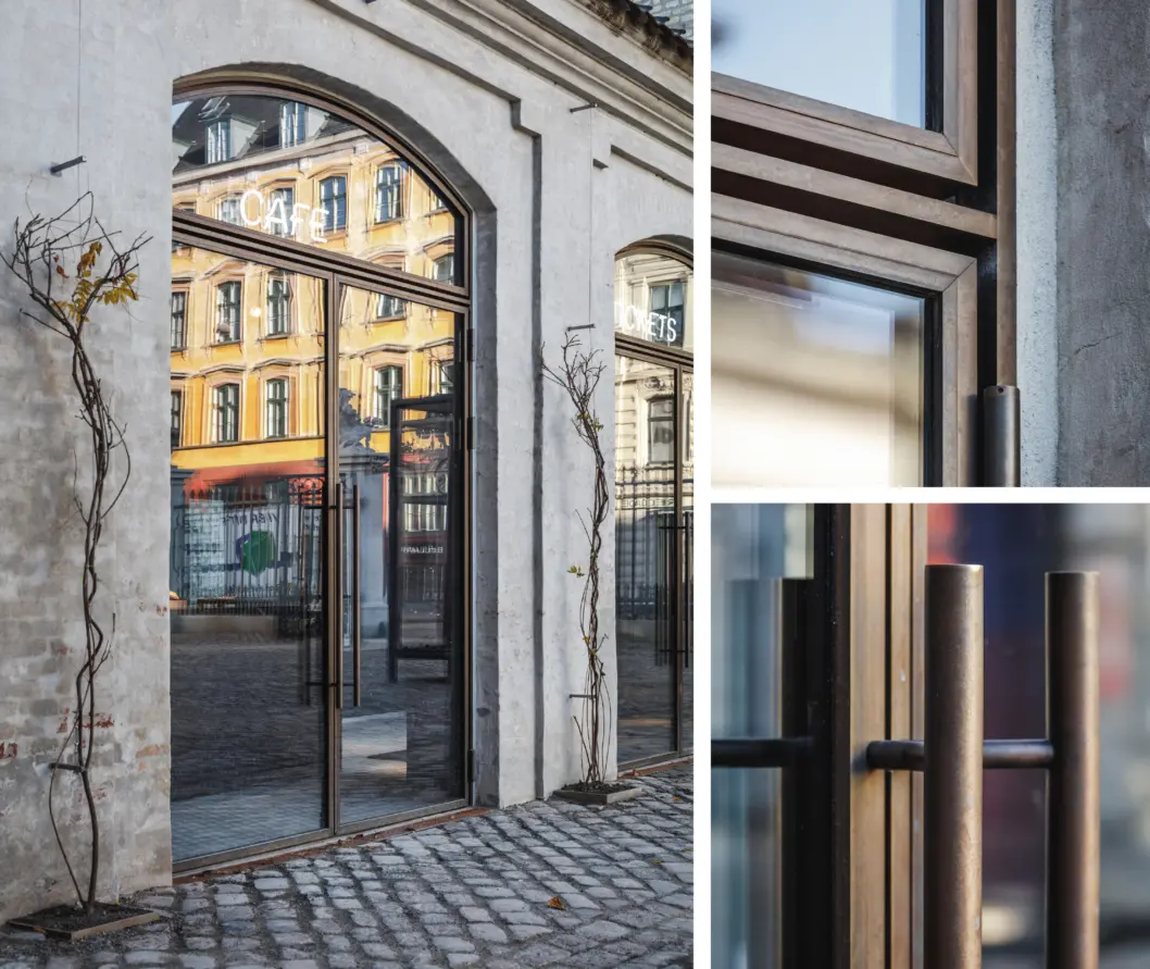
The old annex is completely transformed and opened with arched double doors that follow the original recess in the masonry. In the spirit of the place, all elements of the forecourt are of high quality both in design and materials and respect historical features from the original plans from the 1750s.
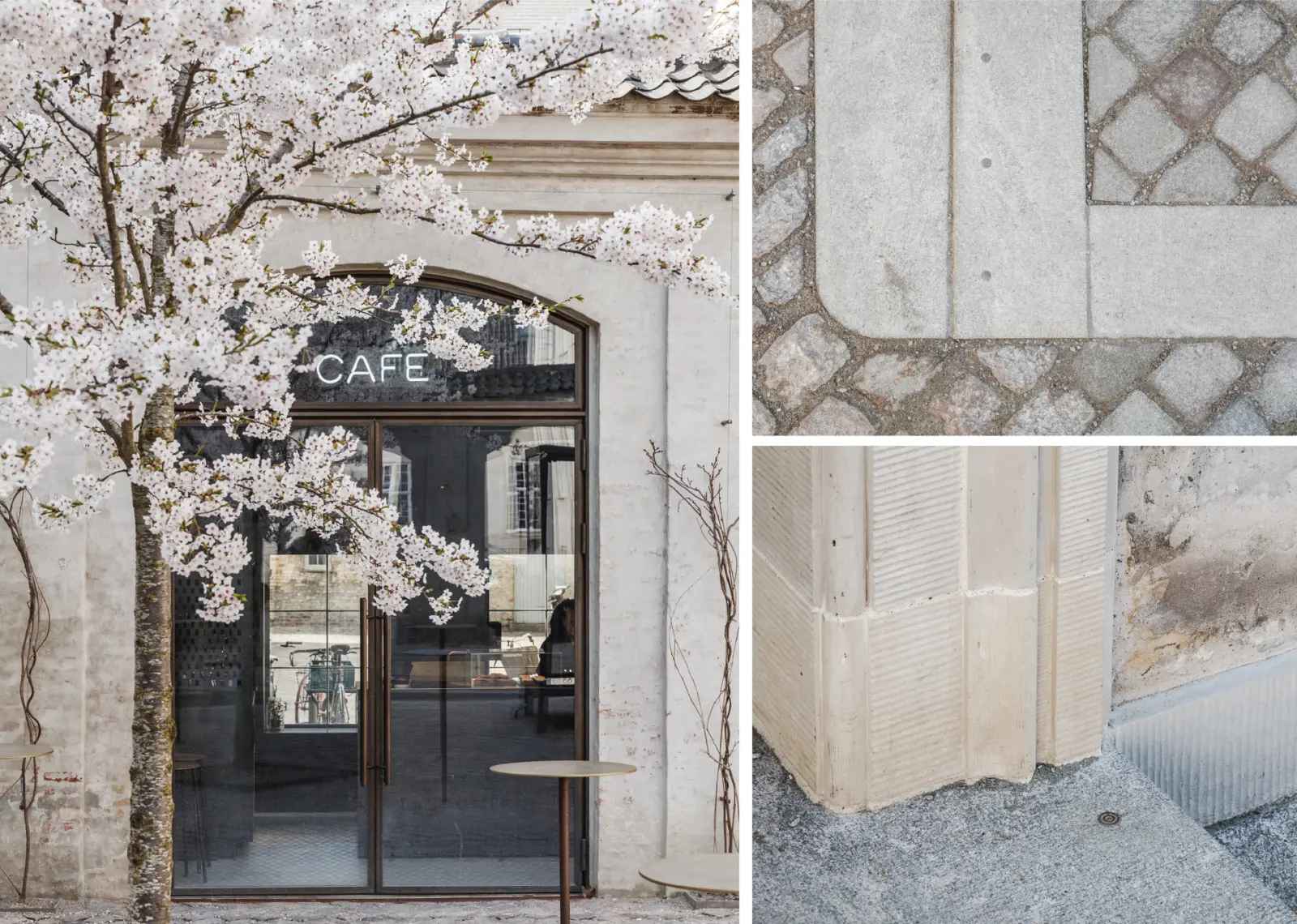
The materials chosen reference the historic materials already present on site to fit in and patinate beautifully over time.
existing framework
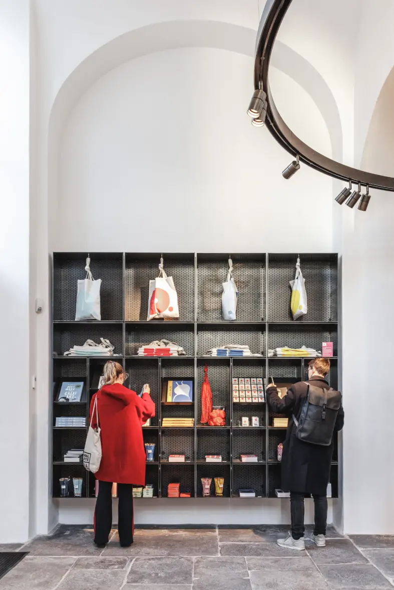
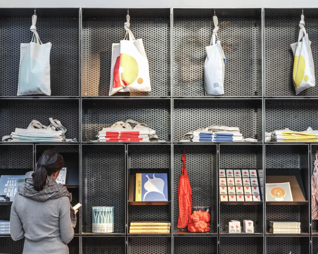
Hot rolled steel is used for the lighting rail and shelves in the museum shop.
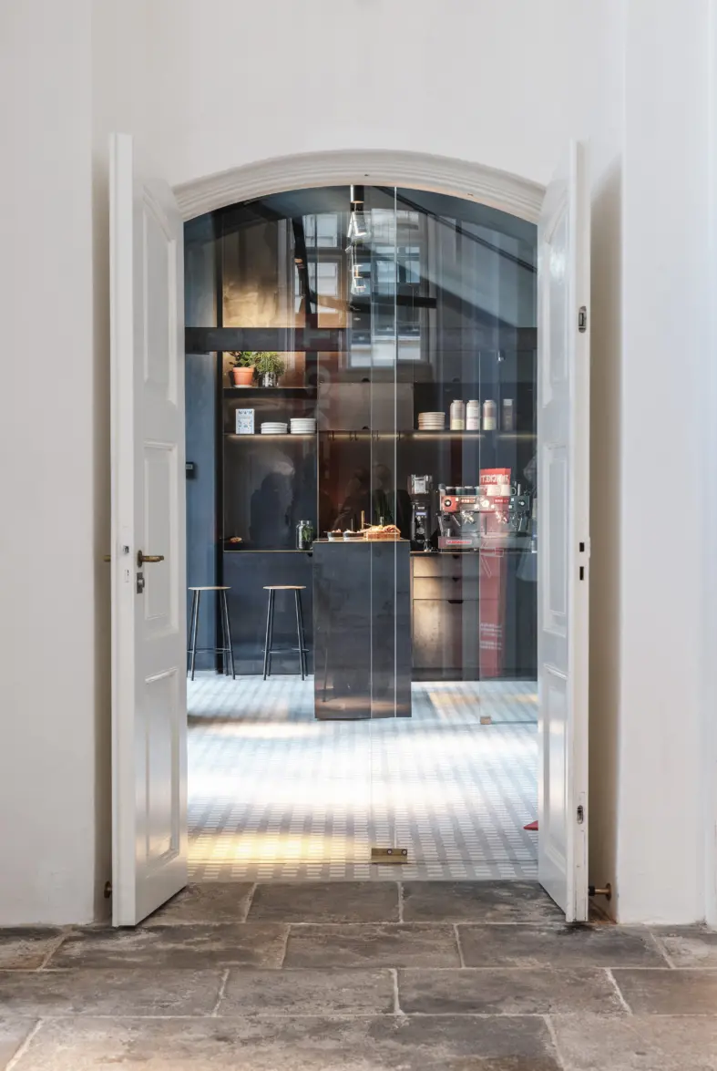
A new entrance is established through the annex providing wheelchair access to the ticket office. This creates a new flow for the guests and creates an unforced exposure to the museum shop located in the grand arched space that used to be a pharmacy. The hot rolled steel plates used for the shelves and lighting rail in the shop reference the blackened steel found on the original balustrade of the space.
The new coffee bar invites visitors inside and in spring and summer flows together with the plaza outside where you can enjoy a coffee and pastry under the blossoming cherry trees whilst enjoing the free outside exhibition.
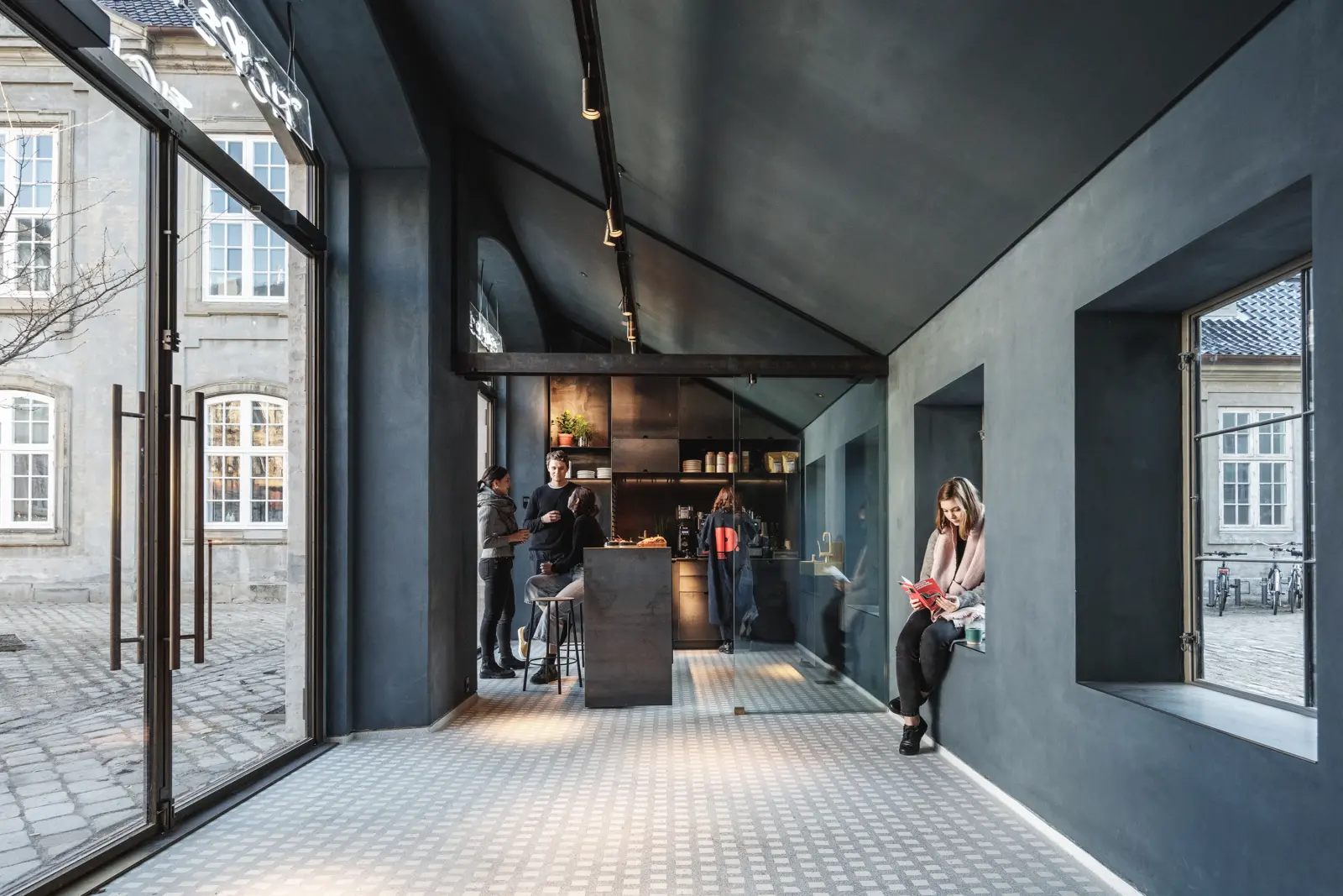
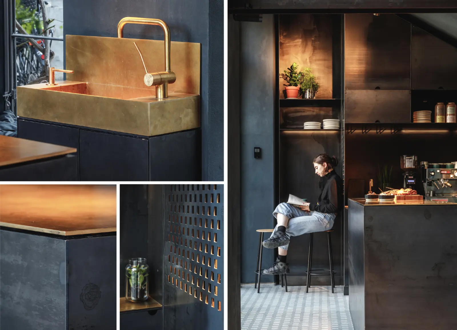
The cafe interior ties together the materiality of the ticket office and the outdoor space. Brass and hot rolled steel are used to create an atmospheric and dark space with contrasting huge doors and windows to let in daylight. The walls are painted in a special linseed oil based paint in the colour “Museum blue” specifically developed for this project.
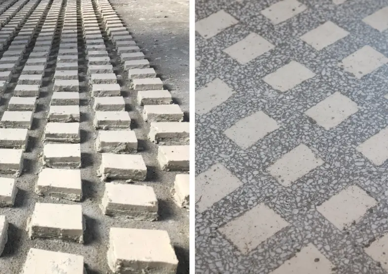
The floor is cast in a mix of terazzo and glass mosaics from Venice. The pattern of the mosaics is used mirrored in the steelworks and references the pattern of the cobblestones on the outside plaza and in the ticket office.
