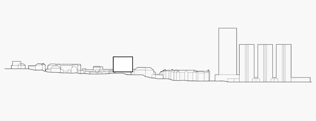
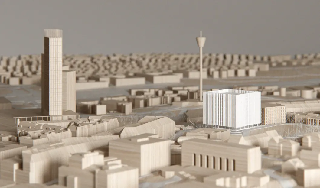
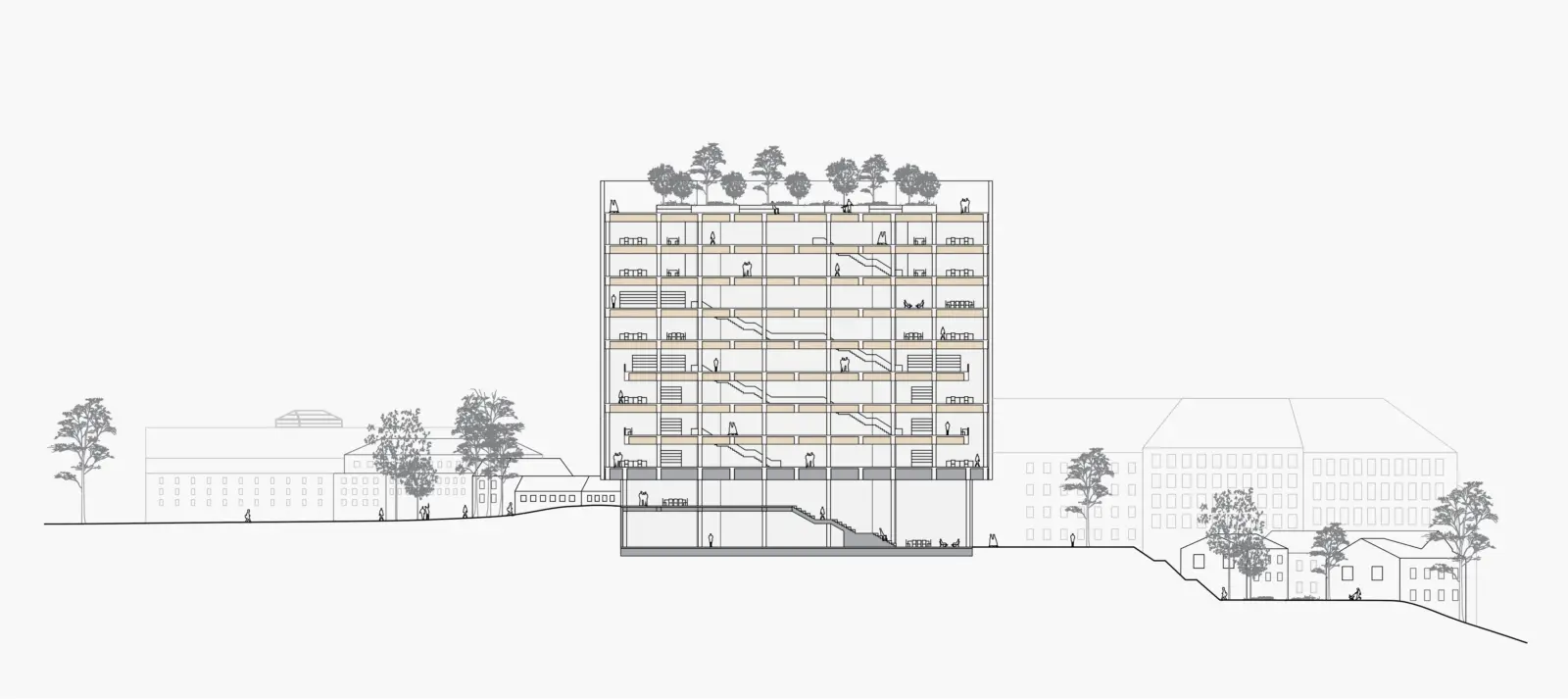
Urban section showing the scale and relationship between the university area and the city of Gothenburg.
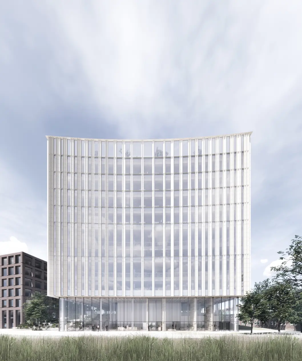
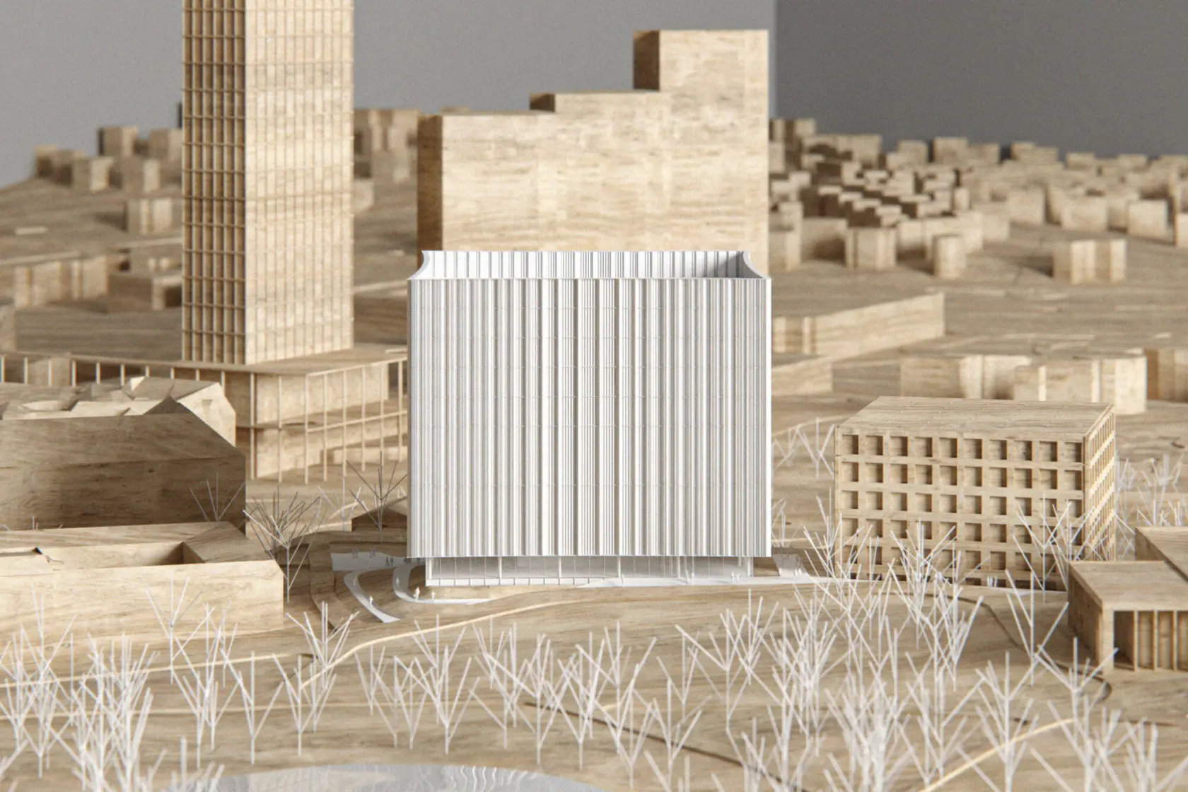
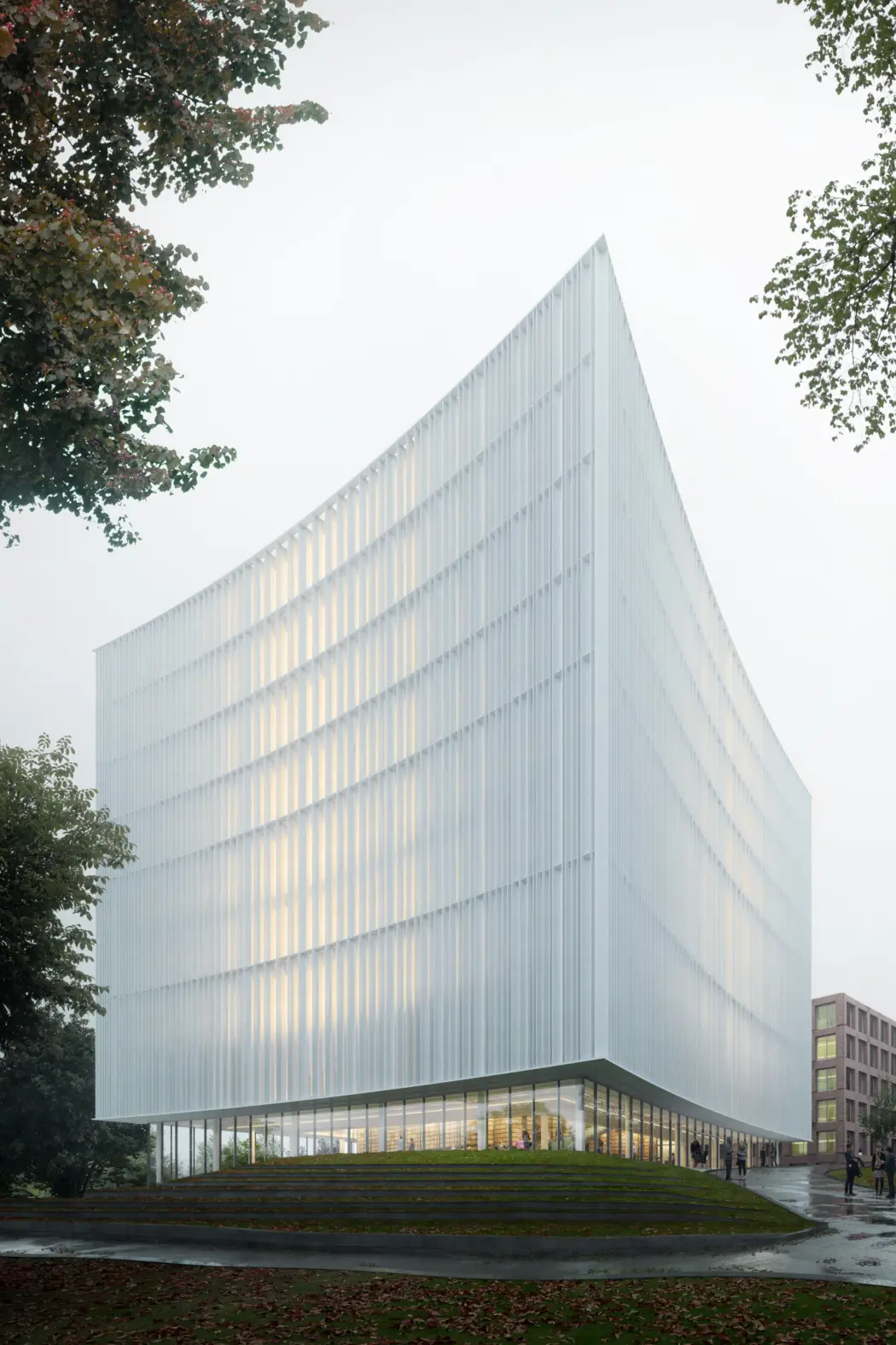
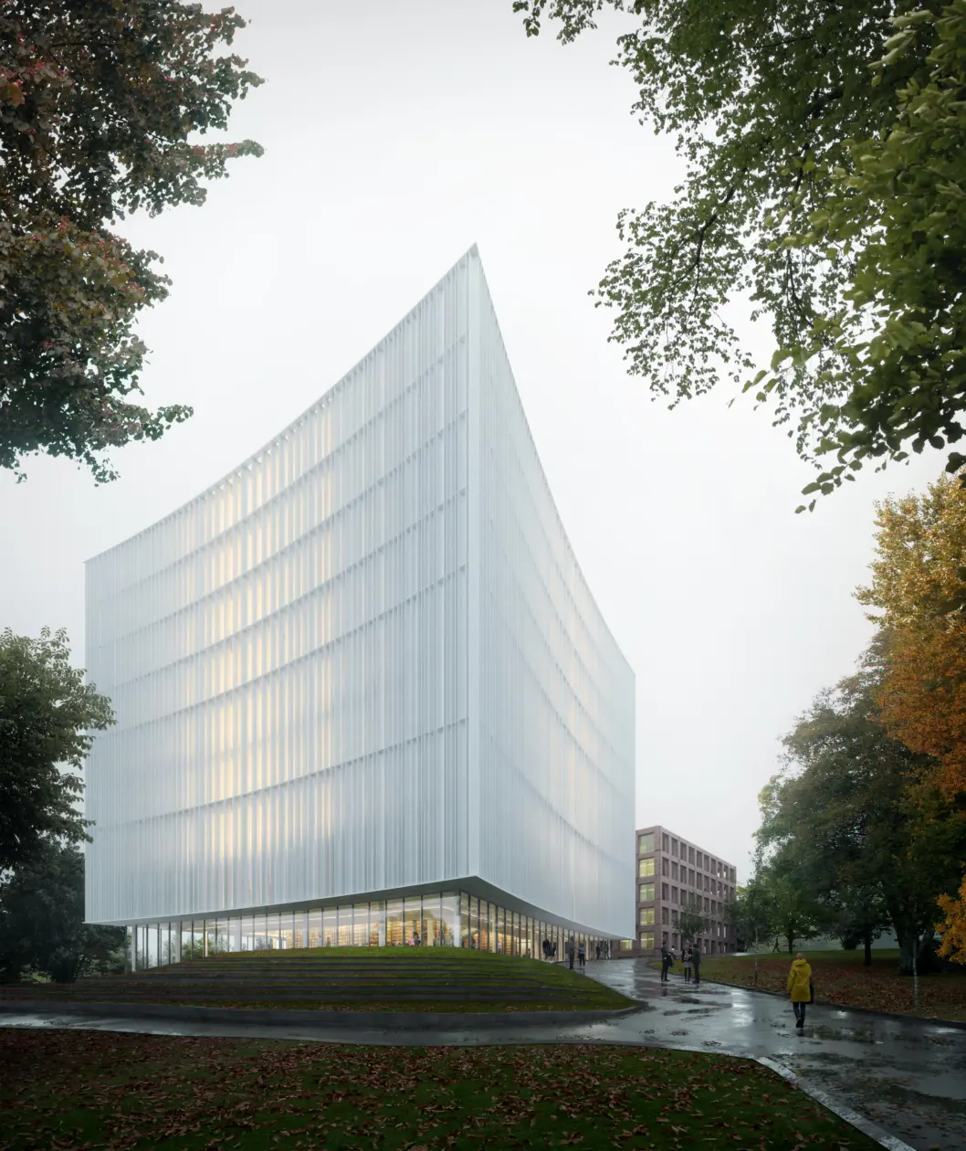
Gothenburg’s new university library is to be located between the city center and the Näckrosen university campus, between large and small scale – intense and quiet – on one of the best sites in the city – in the heart of Näckrosen Park. Like a lighthouse on a hill, the university library will be a new landmark, lighting up from within and looking out over its surroundings.
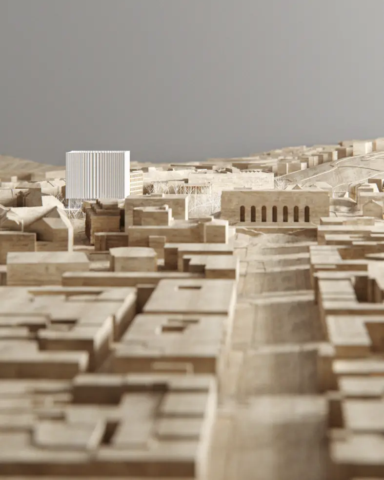
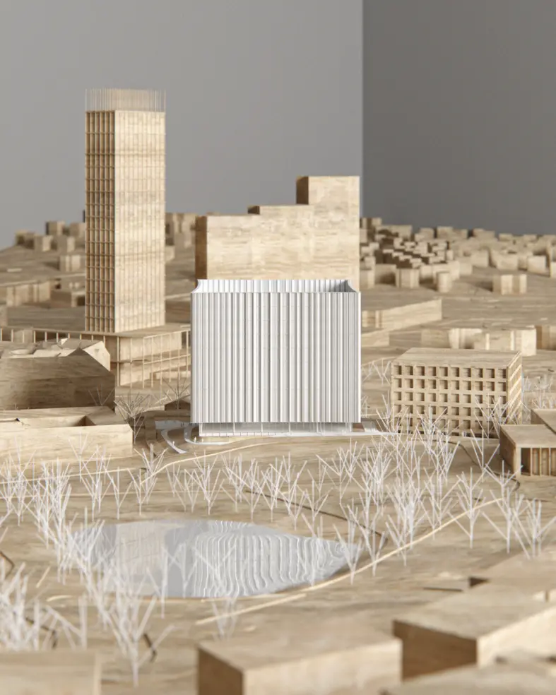
The university library acts as a mediator between the campus area and the city center.
A careful analysis of the site led to a deliberate decision to open up the landscape and Näckrosen Park’s rich environment, by creating a visual and a physical connection between the campus area and the nearby Korsvägen public square and transport hub.
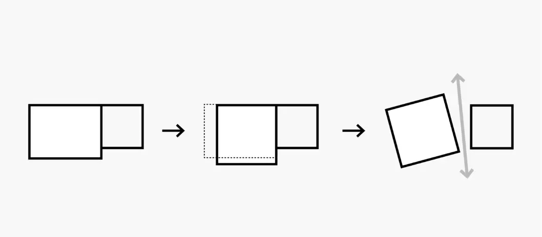
The building’s footprint is minimized to preseve the landscape and to make a connection between the city center and the campus area.
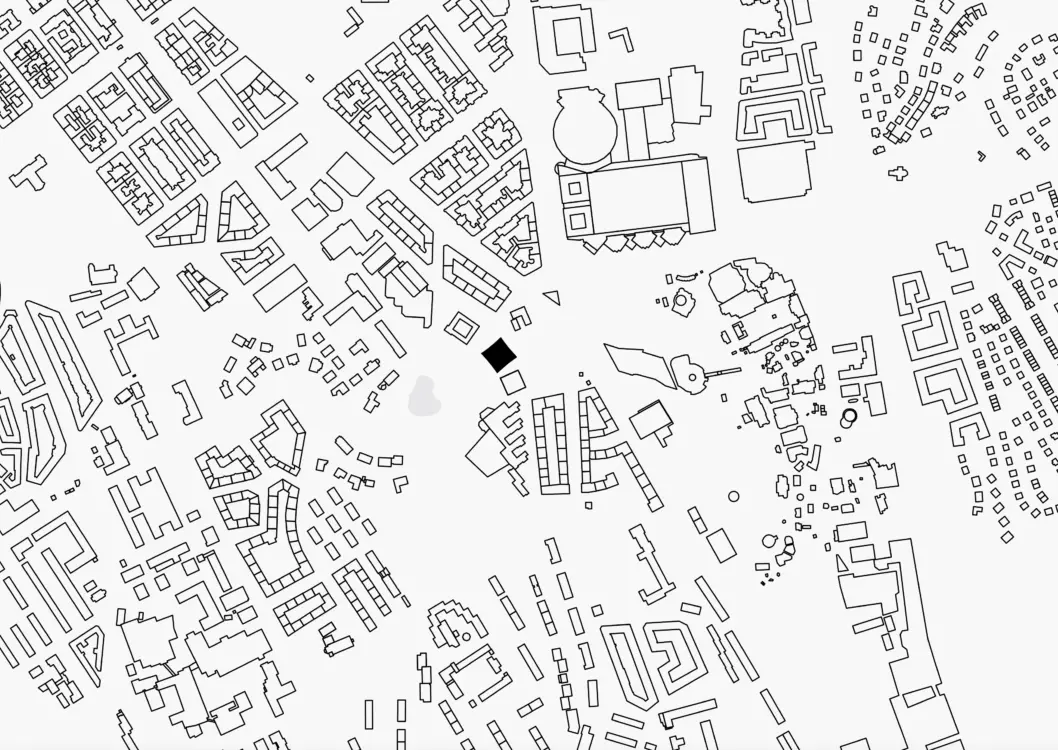
This connection is established by minimizing the library’s physical footprint, which in turn separates it from the adjacent existing building and yields its compact volume. The new university library becomes a natural part of an ensemble of stand-alone buildings in the park – while at the same time it thoughtfully stands out through its vertical expression, materiality and color.
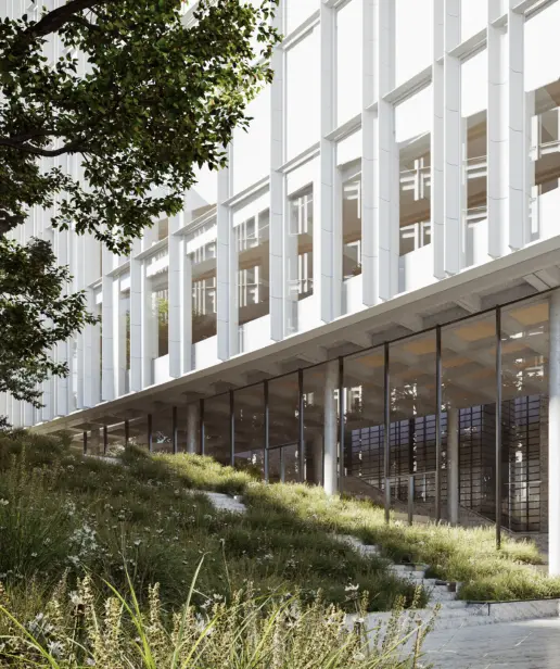
No matter the direction one approaches the university library from, you are welcomed and drawn in to its visually open and transparent ground floor. Much like an open book, the library invites you inside, from both its campus and its city sides.
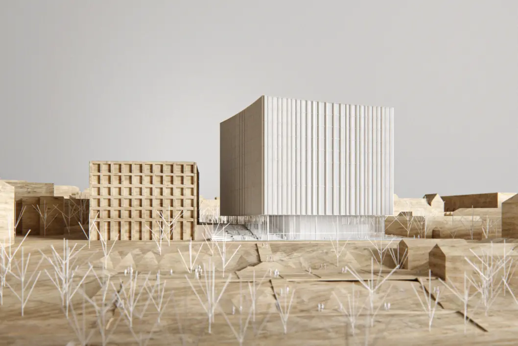
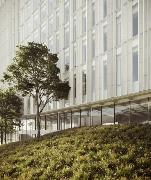
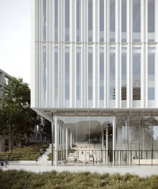
With the library’s placement at the top of the hill, we aim to create a distinctive beacon of knowledge. The book serves as the inspiration and point of departure for the design – the building volume, its colours and materials all point to a book being opened. Regardless of which direction you approach it from, you are invited in. The integration of the building and park was a key consideration from the outset, and we have deliberately preserved as much of the existing park landscape as possible. In doing so, we have created an open connection between the city, the university and the library’s users.
Dan Stubbergaard, architect and founder, Cobe
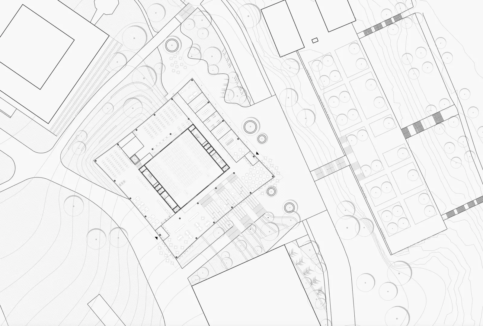
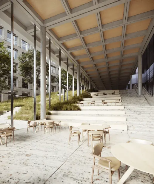
The ground floor reveals itself as lively meeting place that mediates the transition between city and park, as it weaves together with the surrounding landscape.
wooden cube
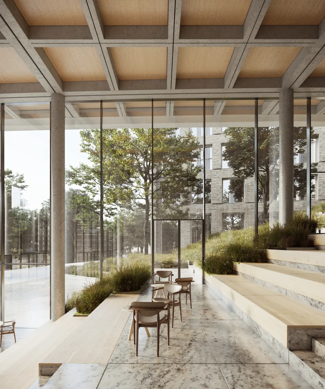
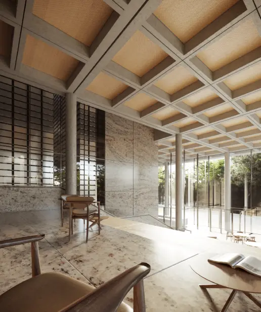
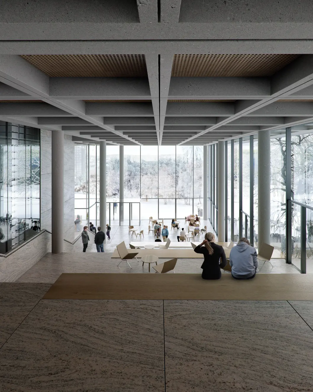
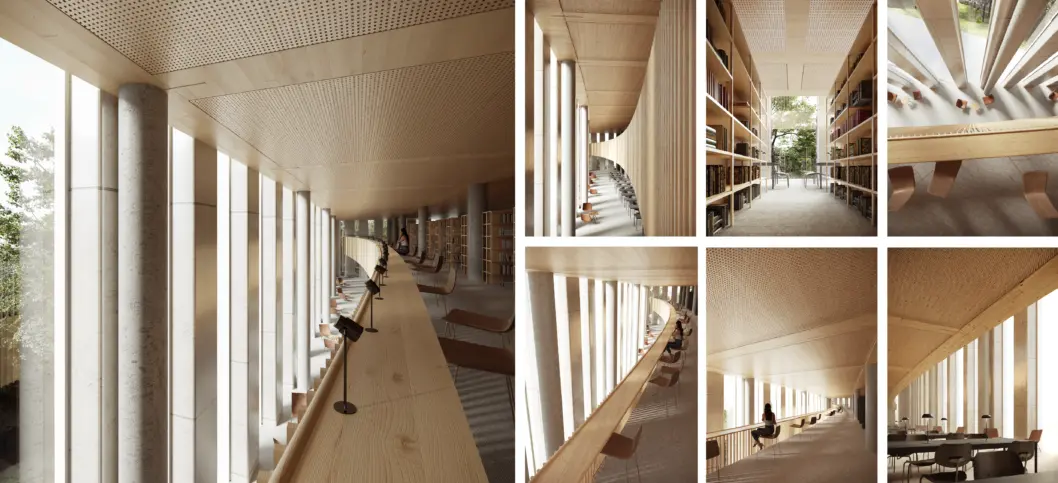
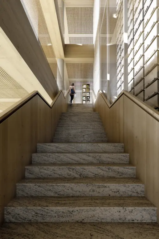
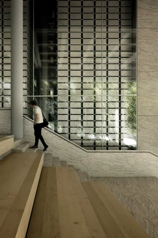
The library houses a multitude of spatial experiences – from the open, bright, and magnificent – to the intimate and tranquil. This is emphasized by a finely calibrated use of diverse materials, from light and robust granite on the ground floor to the warmer environments of the upper floors, featuring wood and textiles.
This highly intentional choice of materials is also reflected in the building’s load-bearing system, which will be a hybrid between concrete and wood. These distinct materials are used purposefully based on their specific properties. Concrete is highly visible on the lower floors of the building where it allows for greater openness, while wood beams are used for the smaller spaces found on the upper library and office floors.
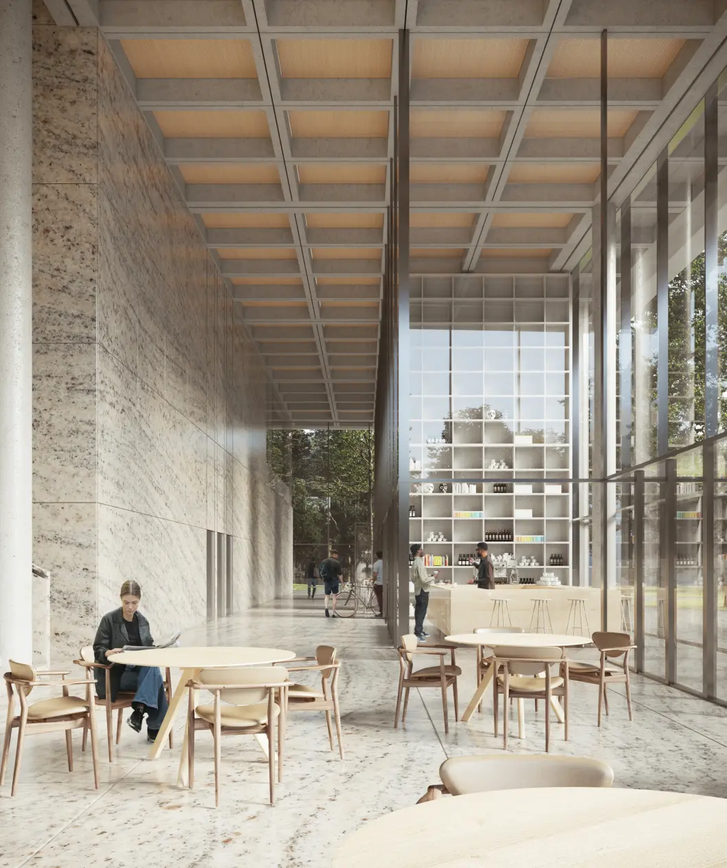
The entrance zone on the ground floor follows the landscape.
The ground floor entrance area is placed so that it connects the city and campus. It is intended as a large and bustling meeting place where the activities that will take place there flow together with the surroundings. The level difference found in the landscape is elegantly taken up by flexible stairs with seating that can be used for many activities – such as study, a café, or audience seating for an event.
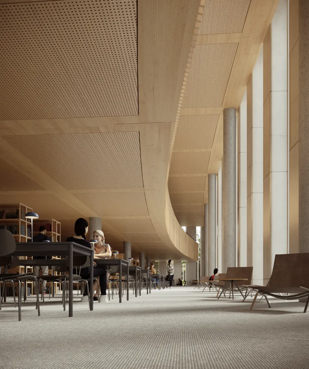
A library must be a place for in-depth study and focus as well as for dialogue and collaboration-oriented activities. The project therefore enables a wide variety of learning, working and social environments.
depository as the
heart of the building
In the library’s very center, an automated book depository stands spectacularly as the core of knowledge, surrounded by the building’s varied functions. Elevators and other self-contained functions are located along two closed ends of the book depository, which lend a high degree of flexibility to the floor plan.
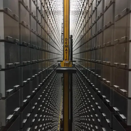
An example of an automated book robot.
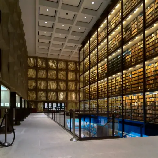
The Beinecke Library at Yale University, where the book stacks are celebrated as the physical container of knowledge within.
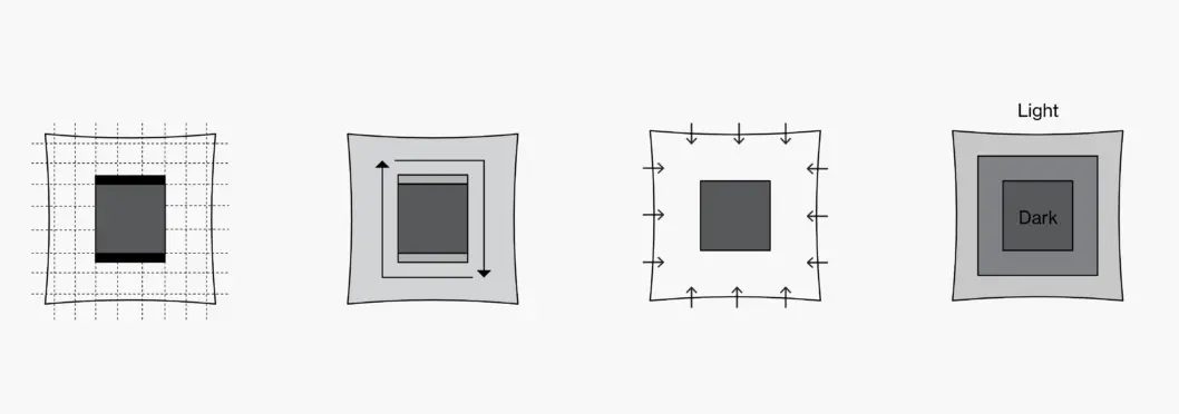
The automated book depository is placed in the center of the building, defining flexible study and work spaces with optimum daylight conditions as well as views over the campus and city.
The layout of spaces can be described as democratic – with views of the surroundings and excellent daylighting conditions found on all sides. Two open ends of the automated book depository showcase its inner workings, making visible the library’s dynamic machinery as you move upwards alongside it.
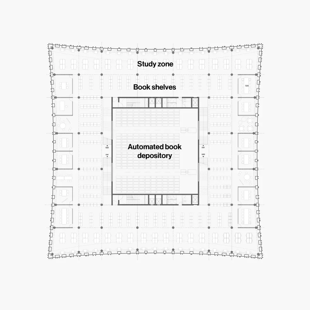
A typical library floor.
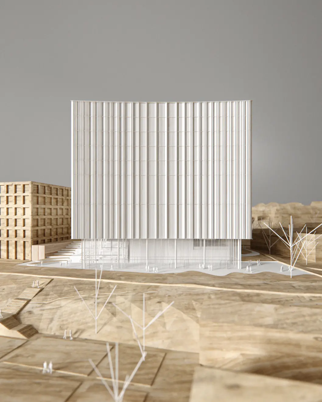
façade

The façade is intended to express an open book.
The façade appears as an open book. This expression is created by a series of vertically extruded ceramic tiles that bring to mind the pages of a book. This uniform element façade is produced under factory conditions and transported to the construction site for assembly – increasing the quality and precision, and reducing on-site assembly time.
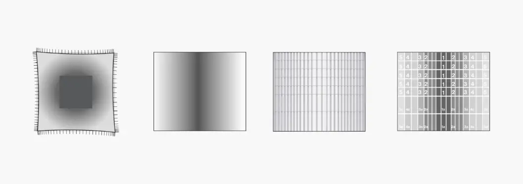
The ceramic lamellas are positioned on the façade in a gradient pattern, with tighter spacing at the building corners – giving a more opaque façade where interior overheating often occurs.
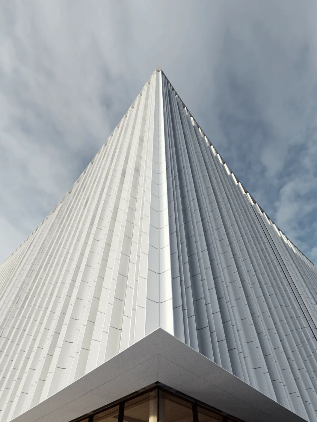
The geometry of the façade’s 5 distinct elements is parametrically optimized in relation to daylight conditions – positioned on the façade with a more open spacing in the center of the volume and a tighter spacing near the corners. In this way, the glass area of the building is reduced where internal overheating typically occurs. The extruded ceramic tiles are also shading devices themselves, further reducing the amount of sun that enters the building.
